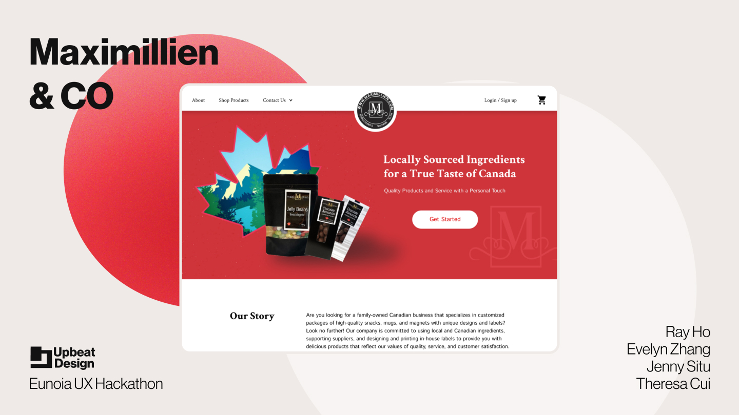
Maxemillion & Co

A website that lets people customize their own gift basket

The Context

Our team "Upbeat Design" explore Maximillien and Co to discover there is a need to streamline communication and ordering process for Maximillien's product catalogue and customization services

Project Details

1 Week UX Hackathon Project
Year:    2023
Tools:   Figma
Team:  Theresa Cui, Evelyn Zhang, Jenny Situ
Role:    UI Design, UX Research

Problem Statement

How might we communicate the customization service to the hotel managers/event planners, helping them to understand the process and expectation given that they have unique needs and requirements .
Brain storm sprint session find the problem statement with “How might we”

The Impact

The Design Impact

By streamlining the customization process online and including more informative guidance, our solution can make the communication process between the customer and business more structured and reduce any unnecessary offline communication/transactions.

Feedback from the client

The client expressed satisfaction with the manner we organized the landing page and the consideration that the accomplished solution will be customizable through WordPress.

Overall Comments from the Judges

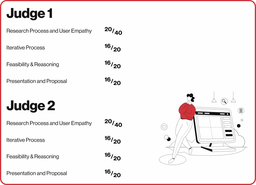
Both judges agreed that we had a clear articulation of the issue area, strong research, a decent design process, and a good solution that addressed both user and customer pain points. They felt that our presentation demonstrated a thorough comprehension of the users' requirements. Accessibility, project testing for solution effectiveness, and non-groundbreaking design are all areas that require improvement.
Early Ideation

Initial Review

We aimed to define the problem statement and identified the question we wanted to solve. We examined the website and shared our first impressions and personal connections with the issue.

User Interview

Through 6 user interviews we’ve concluded the following.
Most processes such as promotion and recognition were done in person, cell phone calls, or cold emails.
They care about the quality and price
Several users from the business administrative background as well as souvenir shop workers have similar patterns, staying several minutes looking through the catalogue, where they eventually stop and proceed to call the number as the solution.

Competitor Analysis

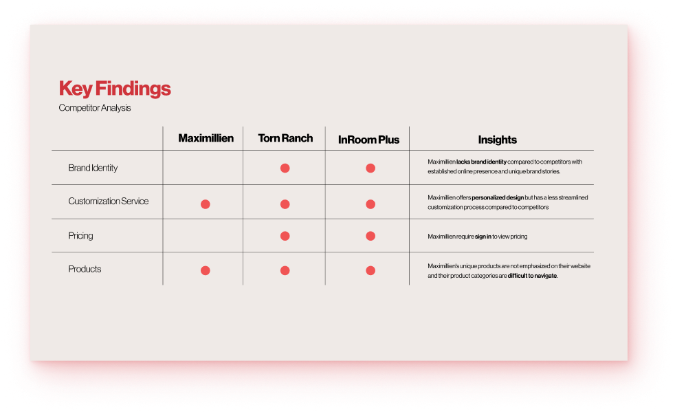
Our initial UX research included a competitor analysis. We found that competitors had a more focused target audience, a more established brand identity, and provided informative buying processes, selections, and prices on their website.

Wireframes

For our initial wireframes, we designed our own individual approach to the solution and came up with several different wireframe samples, eventually settling on a desktop design approach based on our user age group and behavior process.
My first wireframe for the landing page of the website
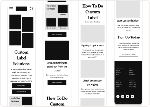
Mobile Wireframe
Final Wireframe
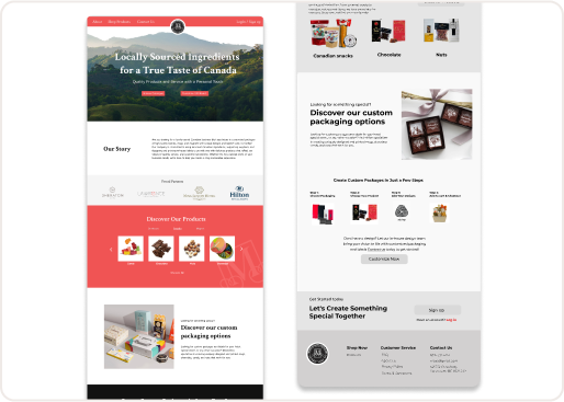
High Fidelity Wireframe

Final Designs

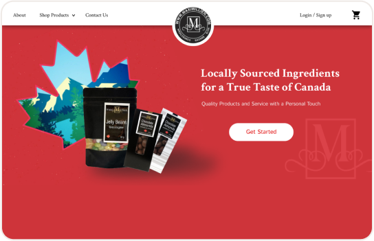
Our design solution enhances the customer’s buying journey by creating a landing page that clearly communicates the brand, guides them through a step-by-step process of using the service, and incentivizes sign-ups for easy customization and ordering."

Before

After

Website Structure Break Down

To strengthen and capture the attention of new customers. We want to add a quick value to the service they provide. We also added a visual element and follow up with a CTA for the hero section of the website.
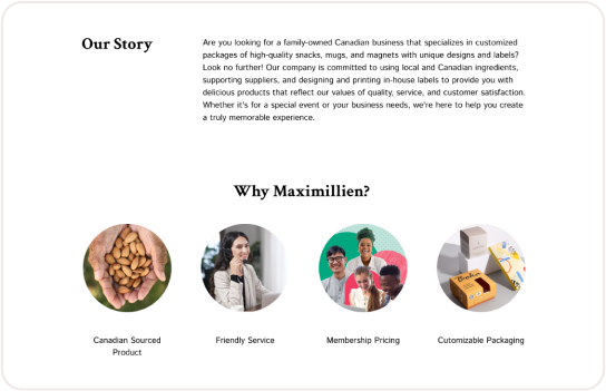
Our goal was to ensure that the new design should tell a story to build rapport and differentiate itself from its competitors.
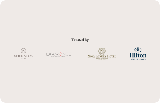
Build credibility, help customer decide if this business is the right fit for their needs and goals by having social proof, make the service believable.
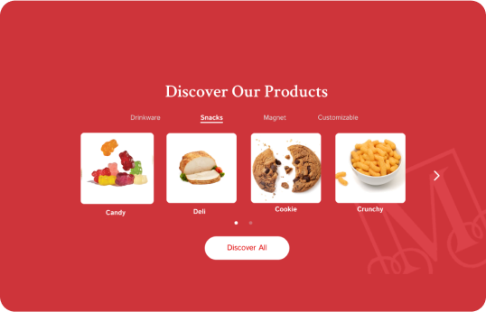
This section adds an option to discover products immediately and inform customers the main products Maximellian offers.
This section show the customization process so customers know the service and help them build expectation and handle rejection.
Users comments section after instruction to increase the reliability.
This section also shown the products that company did for the other buyers to set a standard of trust.
We wanted to close it off with a call to action for a chance to convert the consumer to sign up.

Further Solutions

Intervention Opportunities

To further build upon the home page, we came up with 2 explorations to communicate the customization process. These 2 explorations tackle customers facing ambiguity when ordering customizable products.

Redesigned Contact Form

The first concept is adding a request quote form to the contact page which tailors to customers with specific needs. This allows them to provide necessary details and requirements and gives Maximilien a starting point to better assist customers.

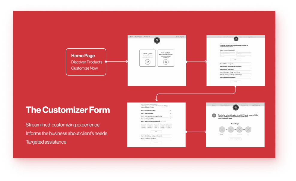
Redesigned Customizer Form

Our second concept is a customization recommendation form. This form can help Maximilien to understand the customer’s expectations and goals, thereby offering recommendation and pricing. Customers know what the options are and ultimately help streamline the consultation process.

Future Steps

Final Thoughts

In conclusion, by streamlining the customization process and including more informative guidance, our solution can make the communication process between the customer and business more structured and reduce any unnecessary offline communication.

What’s Next

Moving forward, my team and I would like to conduct user testing to gather feedback and insights on the usability and effectiveness of our design. This will help us refine and iterate on our solution, ensuring that it meets the needs of Maximillien's target audience and aligns with the goals of the project.
I really enjoyed working with people I had never worked with before and going through the complete UX design process of ideation, research, design, and presentation in a short amount of time.
Thank you for reading through my design process and design collaboration. Hope you enjoyed about our design and though process.
WEBSITE DEVELOPED AND DESIGNED BY RAY

Let’s Tell Your Story